What began as a simple grassroots effort decades before known as the Traverse City to Charlevoix Trail, TART Trails and Top of Michigan Trails needed something with a deeper brand identity than simply a point A to B trail to help jumpstart a $50 million fundraising effort. What they wanted was a brand that reinforced the region’s identity of beautiful land and water and to highlight the region as a trail destination.
The project presented many challenges, including developing a brand with broad appeal, creating a brand that could draw inspiration from the regional identity, but not use other themes that have already been used, and lastly create a brand that could stand the test of time.
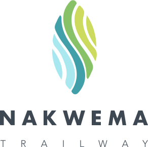
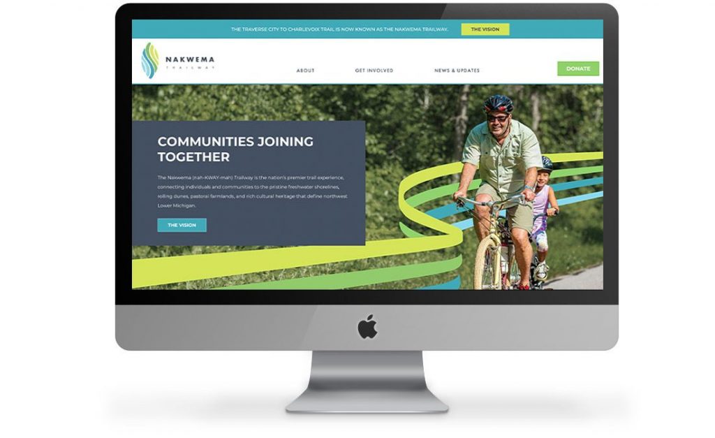
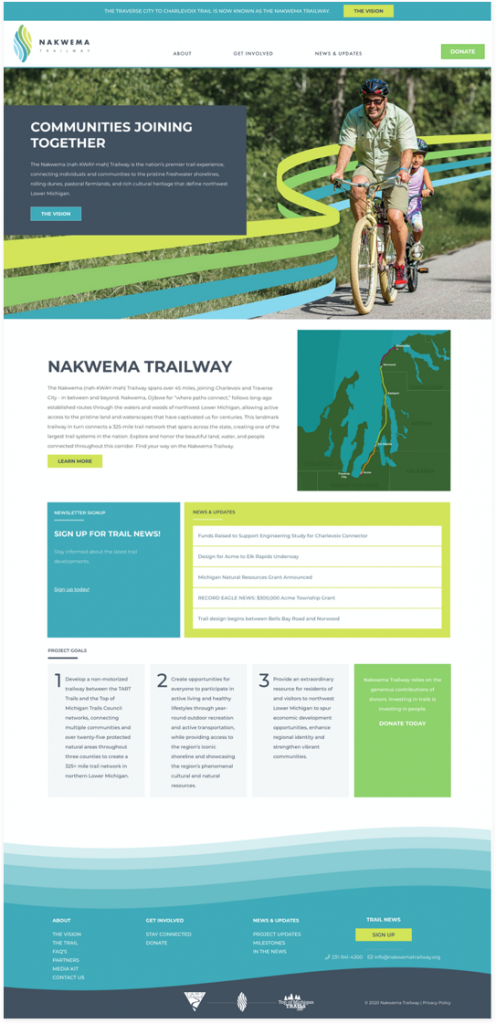
Nakwema, an Ojibwe word meaning “where paths connect,” is a nod to the native people of the area while also being a nod to the vast trail network that this path will connect.
Scope of Project
- Strategy
- Branding
- Digital Campaigns
- Web Design and Development
THE MARK
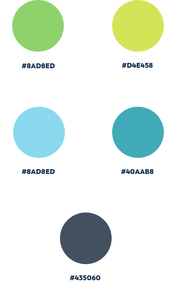
Lake Effect explored numerous themes as they related to land and water and how they could be presented together with something unique. The selected icon represents a leaf or a seedpod that offers elements of land as well as growth. The pattern inside the mark represents the topography of the area—varying nature and farmlands represented in green as well as waves and shoreline represented in blue.
BRAND GUIDELINE
WEBSITE
MAILING CAMPAIGN
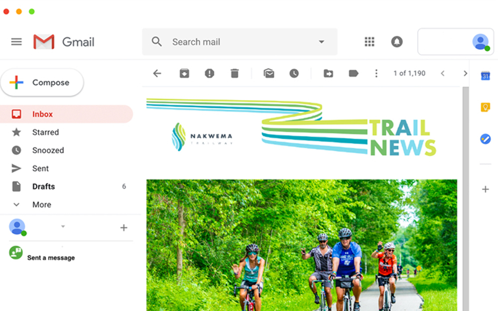
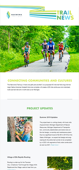
The client needed a new email newsletter template to help communicate the early stages of the new campaign, as well as updates as they related to the project. Lake Effect developed an easy to use design and management system to help facilitate this communication work.